Summary Dashboards
In V4.0.38 the new Summary Dashboard feature was implemented for Inventory, Customer and Vendor File Maintenance. This dashboard allows you to examine up to 25 years of history data from the ARSUMRY table.
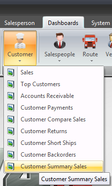
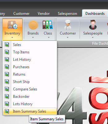
•The Summary Dashboards can be accessed via the main Dashboards ribbon menu using the Inventory, Customer and Vendor sub-menus.
Dashboard Ribbon Customer Menu
|
Dashboard Ribbon Inventory Menu
|
Dashboard Ribbon Vendor Menu
|
•The Summary Dashboards can also be accessed using the Dashboards menu in the Inventory File, Customer File and Vendor File Maintenance screens.
|
•The new Source for Categories feature has been added to dashboards in the Chart Options menu.
This menu feature allows you to direct the dashboard processes to only use the data in the rows or columns you have highlighted to generate the summary chart. |
|
 Be aware that some chart styles, like Stacked Area, may not provide you with a chart that has a meaningful comparison of the data. Some experimentation may be required to work with this new feature and various chart styles.
The Rows and Columns options in the menu allow you to switch the graph data source category for the horizontal x-axis in the chart. The vertical y-axis will reflect the range of data values for the selected data comparison.
 Summary Dashboards Source for Categories Options
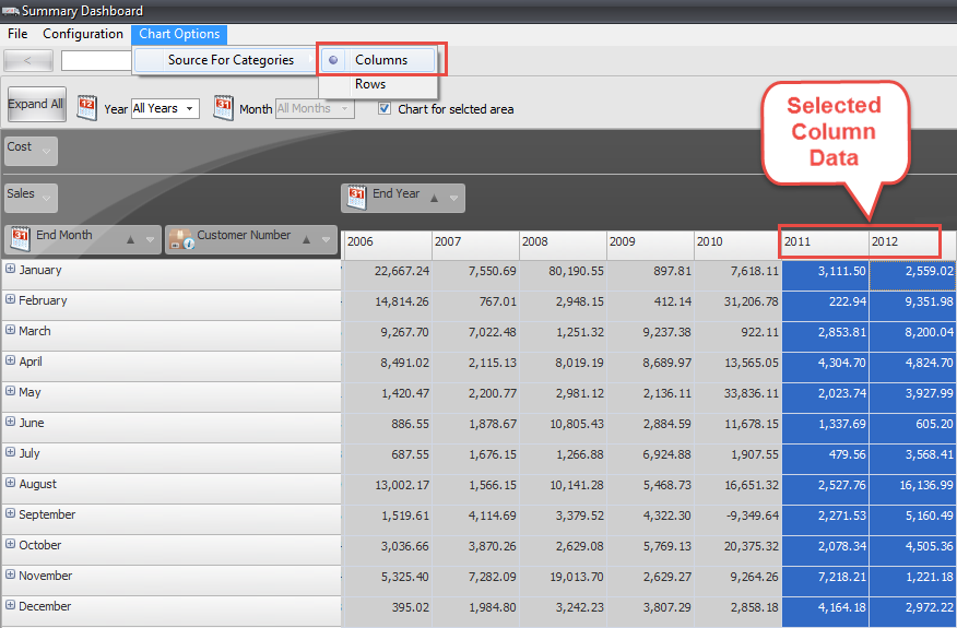
•First the 2011 and 2012 columns were highlighted and the Columns option selected in the menu.

•The first chart was generated for Columns and used the selected column’s headers as the x-axis categories.
The result was a comparison of the Summary data for the years 2011 and 2012 with a column for each month.
(Note: The two charts below were edited to remove some columns to fit on the page.)

•Using the same data when the Rows option is selected the months are the x-axis categories.
The years 2011 and 2012 are the yellow and blue columns in the chart for each month.

 Summary Dashboard with Invalid Anaylysis
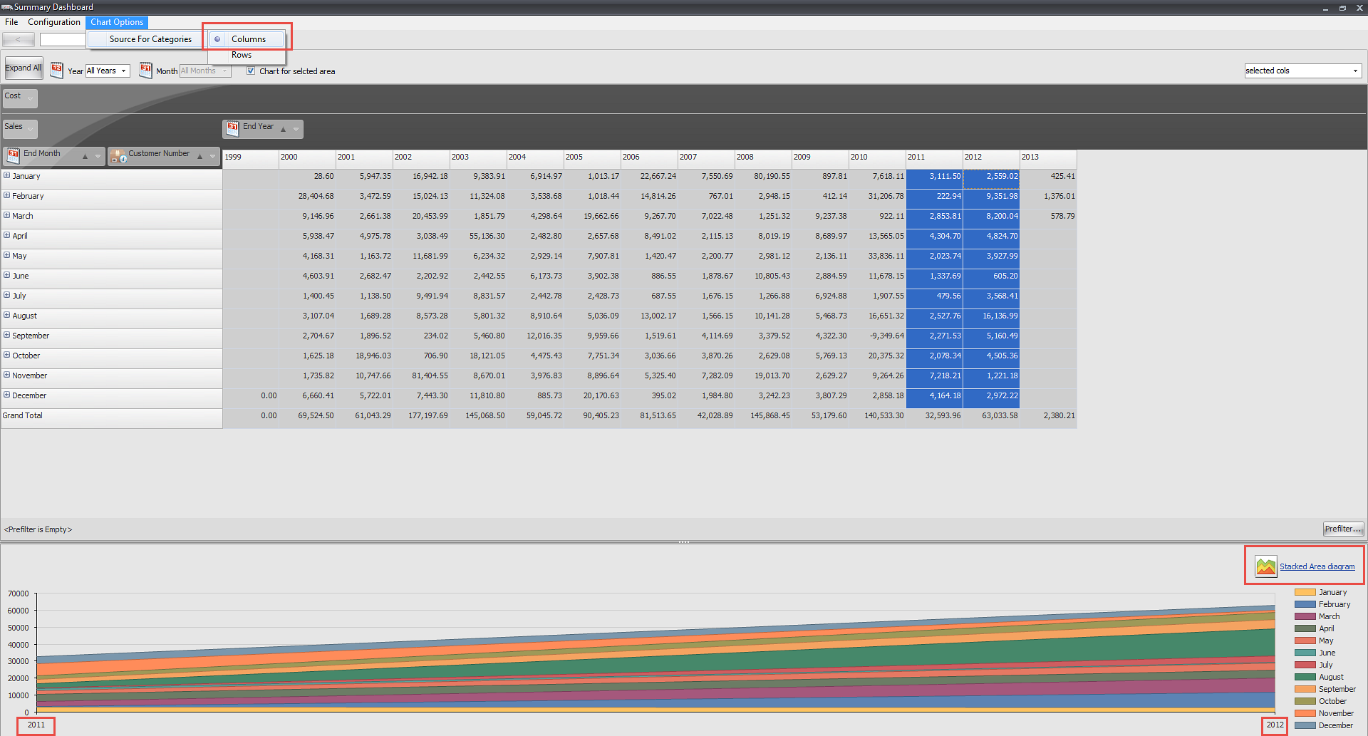
This is an example of a Summary Dashboard for Customer Summary Sales that provided no real analysis of the sales data because of the choices made for the Source for Categories (columns) and the Type of Chart generated (Stacked Area).
As you can see below the data for the two years selected, 2011 and 2012, is not compared properly so there is no analysis just a meaningless stack of data.
So be aware that your Summary Dashboard choices can impact whether you get a valid analysis generated.


